Cue
This is Cue.
One identity across the website and the apps: Notetaker the turtle on brown, ink on warm paper with one blue, a crew of five who each have a job, a soft serif for headlines, and a voice that says things plainly.
The turtle, on brown.
The app icon is the only mark: Notetaker, the crew’s turtle, drawn by hand on a brown tile. Beside the word Cue in Manrope it makes the wordmark, the same on paper, on ink and on white.
 CueOn paperCueOn inkCueOn white
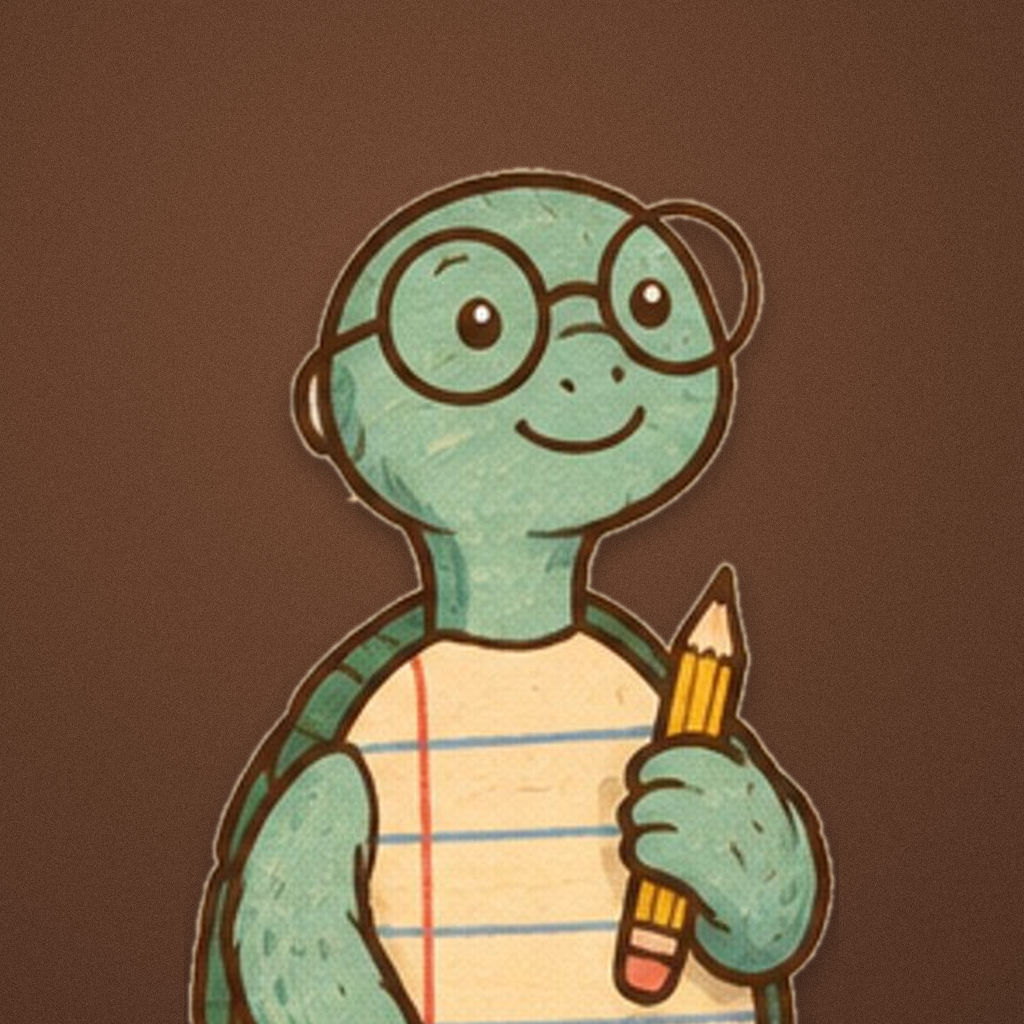
The same turtle sits in the Dock, on the iPhone home screen and in the browser tab; at the smallest sizes it is cropped to its face. It is never recoloured, rotated or redrawn. Download the PNG
Ink on paper, and one blue.
Warm paper, a hairline frame, near-black ink, and one blue that does the working. The ink band is the only dark surface, and there the blue lifts so it stays legible.
Text, the camera housing, the primary button, and the one band that inverts.
The page. A card is white on it, drawn by a hairline.
The frame down the page, the rule between sections, the edge of a card.
The one accent: a focus ring, a switch that is on, Cue itself.
The blue on ink, where the full one would go heavy.
Five crew colours
Each member of the crew owns one colour, and it marks only that member's work: a label, a chip, a dot. None of them is ever a second brand colour.
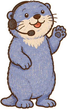
Five members. Each one has a job.
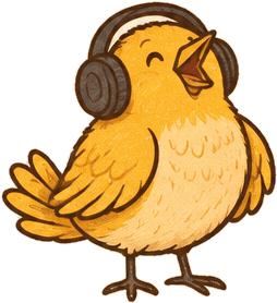
Drawn by hand for Cue, a little fuzzy at the edges, and grown-up enough to sit beside your work. The drawing says what each one does.
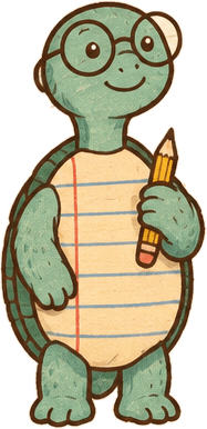
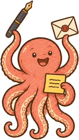
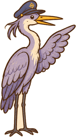
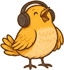
Five desks to open on.
Every page opens on a light Mac desktop: a soft tint, the menu bar, and the notch at the top saying what Cue is doing. The tint sets the mood; the notch is always light glass under a black camera housing.
A soft serif, a plain sans, and a mono.
In the room.
Soft 100, optical size 144, never wonky, at a light 340 and set tight. Headlines and card titles only.
Notes that write themselves.
Every sentence, every button and every row in a product shot, the same face the apps ship.
12:04 · Hold ⌥
Section labels in capitals, counters, timings and keycaps, so a column of times lines up.
Six rules keep it Cue.
One blue, spent slowly
Buttons are ink or white. The blue sets a focus ring, a switch that is on, and Cue's own label, and nothing louder. Each crew colour marks only that member's work.
A hairline, not a shadow
The page sits inside two hairlines that run its full height. Sections are divided by a rule across that frame, and a single ink band inverts the page.
Soft corners
Twelve for a control, twenty-two for a card, twenty-eight for a band. A dot is fully round, which is the whole reason to spend the shape: it is found without looking.
A serif for the headline only
Fraunces, soft and at its largest optical size, sets a headline and a card's title. Manrope sets every sentence. JetBrains Mono, in capitals, sets labels and timings.
The crew explains, never decorates
A member appears where its job is the subject: Notetaker beside the notes, Writer beside a promise. Legal pages and the trust band carry no characters at all.
Say it plainly
The voice is confident and concrete, sentences over fragments, no hype adjectives, and no em dashes, ever. Read a sentence out loud; if you would not say it, do not write it.